This page focuses mostly on ocean conditions, such as marine weather, SSTs, tidal data, buoy data, ship reports and waves. Additional satellite-derived data is available on our Wind Data page (upper level and surface winds) and our Satellite Data page (visible and infrared satellite imagery).
Marine Forecasts & Analyses from the National Hurricane Center (NHC)
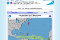
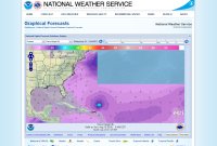
These products are "updated at approximately 2 AM, 8 AM, 2 PM, and 8 PM EDT from June 1 to November 30, with special outlooks issued at any time as conditions warrant. The graphic displays all currently active tropical cyclones, and disturbances with tropical cyclone formation potential" over either the next 2 days or 5 days. "Mousing over the symbol for each weather system displays details for that system; clicking on disturbance symbols or numbers toggles a zoomed view on or off. For additional NHC products on active tropical cyclones, click on the tropical cyclone symbols."
The 2 day outlook contains satellite imagery from before the outlook was released. It does not show the potential formation area for disturbances. The 5 day outlook does not contain satellite imagery, but it does show the potential formation area for each disturbance in the outlook. For a disturbance that is not expected to form as soon, an arrow is drawn from the location of the disturbance at the time of the outlook to the potential formation area.
Example of wave heights (ft) in the Atlantic in the NDFD display
"The NHC/TAFB gridded marine forecasts are available in the National Digital Forecast Database (NDFD). Gridded forecasts of marine weather elements are available over the TAFB high seas forecast area of responsibility (AOR), which also includes the offshore waters forecast AOR."
The gridded marine parameters include: surface (10-m) wind speeds with direction, surface (10-m) wind gusts, significant wave heights and marine hazards. You can select those parameters on the map page or go directly to them below.
To toggle the units you want to use you can click the "Map Options" button on the bottom right of the display. Then select the "Units" panel. Depending on the unit you want it can be a little tricky. If you check "Speed in knots (kts)" it will always use knots even if you selected a different option in "English / Metric Units". Unselect the knots option for the other option to be valid instead.
"The Tropical Surface Analysis and NWS Unified Surface Analysis depict the sea level pressure field by showing lines of equal pressure, usually in increments of four millibars (mb) but often in increments of two millibars where the pressure gradient is weaker (especially in the tropics). The analysis also depicts important surface features that affect the weather, including areas of high and low pressure, frontal systems (cold, warm, stationary, and occluded), troughs, tropical cyclones, tropical waves, the Intertropical Convergence Zone (ITCZ), drylines, and squall lines."
Our site has additional links to surface analysis on our "Other Data" page. The link above simply links to that section on the NHC's page. Other forecasts on the NHC's page include "Wind/Wave Forecasts" (24, 36, 48 and 72-hour) and "Peak Wave Period / Primary Swell Direction" (48 and 72-hour).
"The Tropical Weather Discussion describes major synoptic weather features and significant areas of disturbed weather in the tropics. The product is intended to provide current weather information for those who need to know the current state of the atmosphere and expected trends to assist them in their decision making. The product gives significant weather features, areas of disturbed weather, expected trends, the meteorological reasoning behind the forecast, model performance, and in some cases a degree of confidence."
This is a text product, but it is easier to use the map because you can hover your mouse over the area you want to view data for and have the text appear. You can also click the area to then have the text appear below the map.
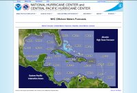
"The Tropical Analysis and Forecast Branch (TAFB) of the National Hurricane Center (NHC) provides forecast and warning information to mariners who travel on the oceanic waters adjacent to the U.S. and its territorial coastal waters in the Gulf of Mexico, Caribbean Sea, and portions of the tropical and subtropical North Atlantic Ocean. The primary alphanumeric product issued by the NHC/TAFB for this purpose is the Offshore Waters Forecast, serving users who operate from the coastal waters out several hundred nautical miles from shore. The Offshore Waters Forecast complements the higher resolution Coastal Waters Forecast produced by local National Weather Service forecast offices and cover the U.S. territorial waters from the coast out to 60 nm offshore."
"The Marine Weather Discussion describes synoptic and mesoscale features expected to affect areas in and adjacent to the offshore waters of the Gulf of Mexico, Caribbean Sea, and Southwest and Tropical North Atlantic Ocean. The narrative describes weather, wind speed, and seas with primary focus on the next 48 hours. The product emphasizes timing and issuance of warnings, includes future trends of wind and sea conditions, discusses the effects of currents such as the Gulf Stream on winds and seas, and addresses how the latest computer model guidance is handling features of significance to the mariner."
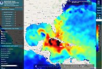
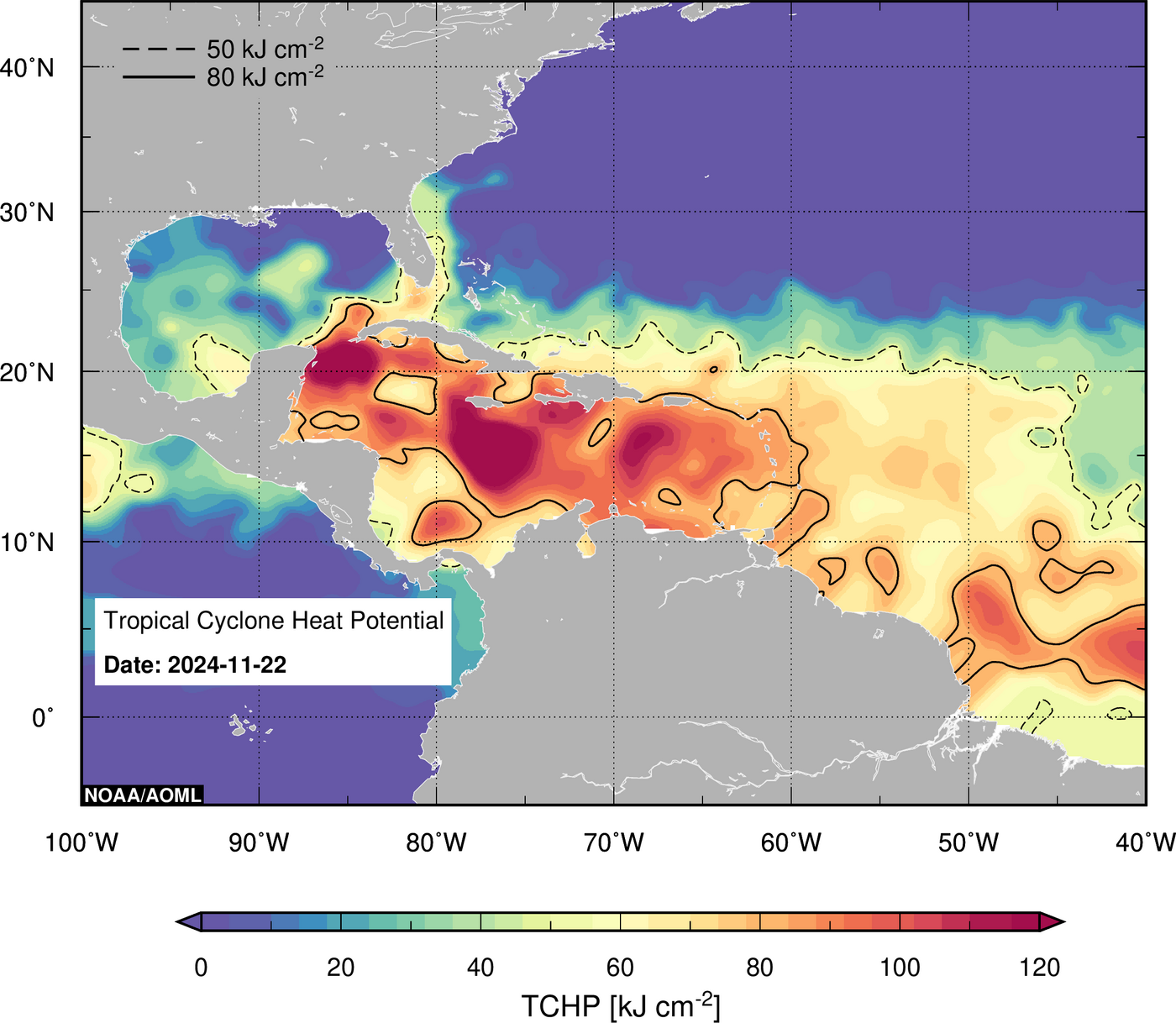
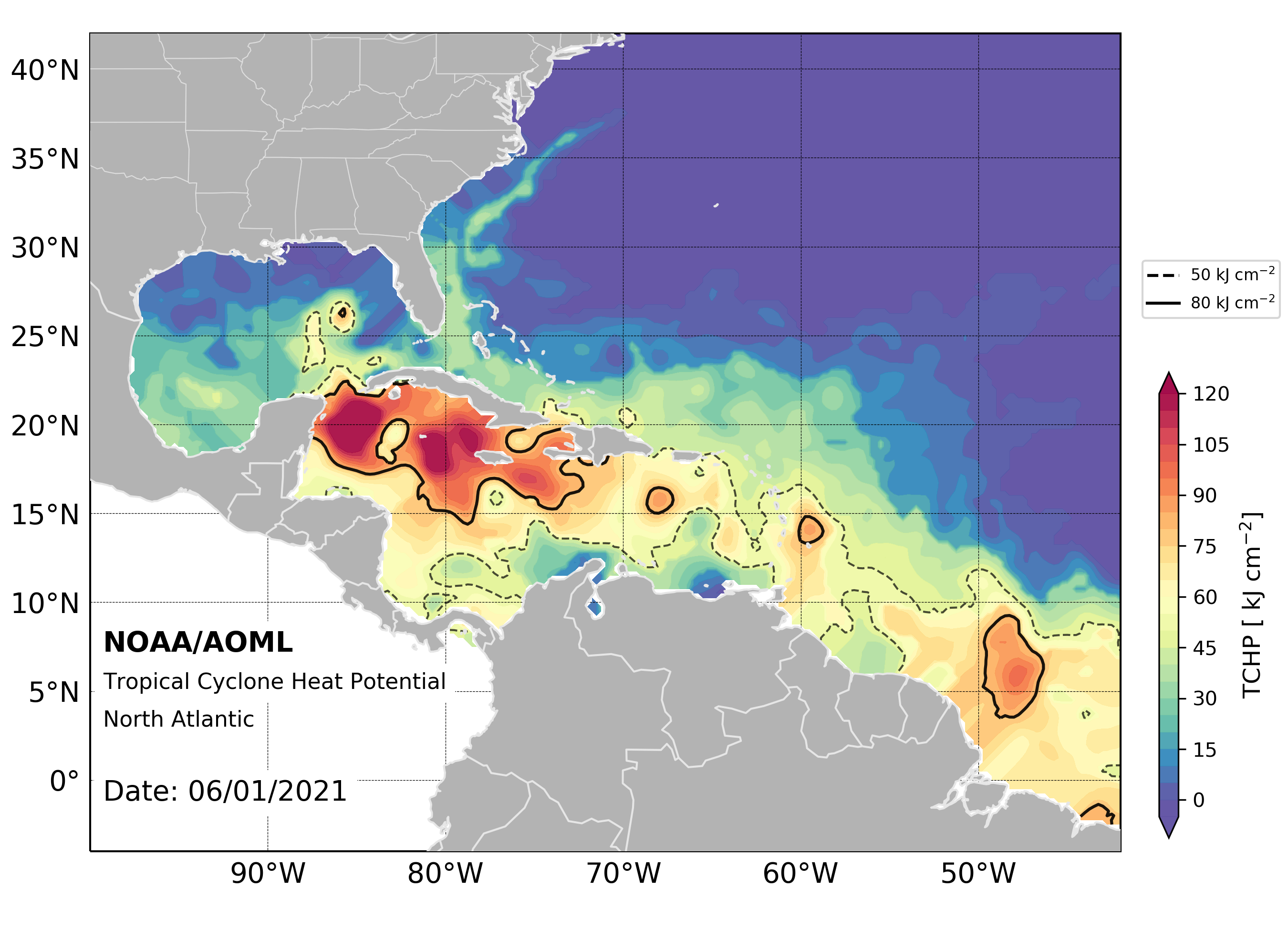
Example of TCHP from NOAA/PhOD Ocean Observations Viewer
This site used to have static imagery that contained TCHP data. That data is now password protected. However, you can still access some data through the interactive viewer here. In the left column, under "Satellite Models and Products", select "Heat Content". You will find an option to view "Tropical Cyclone Heat Potential" or the "Depth of the 26C Isotherm".
A single image for the western Atlantic, with data daily, can be found here. You can also find daily data since June 1, 2021 by looking in the directory of images here. For example, the image for June 1, 2021 can be found here.
The method used to determine what the heat content is of the upper ocean. You can read the introduction and methodology pages for information about the method.
Example of Tropical Cyclone Tracker displaying Oceanic Heat Content - OHC (RSMAS)
To view oceanic heat content along a storm's track, click a storm on the map on their front page. In a new window their storm tracker for the storm will give you a wide variety of options. Click "OHC (RSMAS)" in the "Ocean" section at the top.
You can view various imagery, including SSTs, ocean heat content and the depth of the 26° isotherm. You can view data from the past seven days on the page for a basin.
You can view data for the Atlantic basin and the Gulf of Mexico. You can also view SST imagery, imagery on the depth of the 26°C isotherm and some other imagery. This site has archived data since 1998. You can access it at the bottom of their page.
Sea Surface Temperature (SST)
Some of the sites below have data from the Advanced Very High Resolution Radiometer (AVHRR), the Visible Infrared Imaging Radiometer Suite (VIIRS) and/or the Advanced Baseline Imager (ABI) sensors.
For more information about AVHRR, you can visit the NOAA site here or the Wikipedia article here. For the operational status of the AVHRR sensor that is available on multiple satellites, click here for NOAA's Polar Operational Environmental Satellites (POES) spacecraft status page and here for the Meteorological Operational satellites (Metop) page from the EUMETSAT Polar System (EPS). (EUMETSAT: European Organisation for the Exploitation of Meteorological Satellites)
For more information about VIIRS, you can visit the NOAA site here or the Wikipedia article here. For the operational status of the VIIRS sensor that is available on multiple satellites, click here for the Joint Polar Satellite System (JPSS) spacecraft status page.
For more information about ABI, you can visit the site here for information about the ABI in general, the page here on that site about the SST product or the Wikipedia article here for general information as well on the ABI. For the operational status of the ABI sensor that is available on GOES-R Series satellites, click here for the Geostationary Operational Environmental Satellites (GOES) spacecraft status page.
This is an excellent interactive map that you can load various SST overlays on, such as regional data from AVHRR (about) and global SSTs. You can select a specific color scheme for the SST data loaded and select what range of temperatures to show. You can also add historical SST data as well.
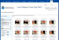
Search for the imagery you want by region, product and sensor. Some of the SST imagery you can view is available below. You can view SST imagery from the AVHRR sensor and the VIIRS sensor. We only found Gulf of Mexico imagery for the ABI sensor. This is single pass imagery. The site doesn't have composite imagery.
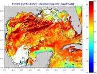
Example of SST daily composite for Gulf of Mexico
This site has AVHRR imagery available. The SST data from a single pass will have less data than the daily composite imagery. The composite combines all the images that were taken that day, up to about 9, and averages them together. However, the single pass SST imagery has a greater selection of regions, over two dozen, that offer a greater level of detail for many of the areas along the U.S. coastline.
For information about how to read a sea surface temperature map, click here for their page about that.
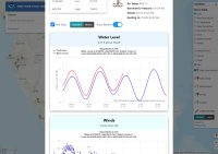
Example of popup window showing water level and other information for a tidal station on their map
This site has tidal and meteorological data at reporting stations all along the coast. Their interactive map can be found here. To view a list of stations with data on tides, click here to view all the stations that have water level data.
When a storm is threatening land, they usually have a page with stations near the storm.
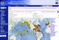
The map on their front page shows the location of over a thousand buoys around the world, some of which are from the NDBC and many others from other agencies. You can click an icon to view a little bit of information from each buoy. You can click "View Details" to view in-depth information. Some buoys contain such things as wind speed, pressure, wave height, tidal information, water temperature and other information. You can get more information about the buoy itself, as well as a picture of some buoys. Some buoys even have cameras that capture images, often hourly during daylight.
When a storm is active, pages at the NDBC will have a link to the "Storm Special". That contains information from observations from a variety of sources, including ships, within 250 nautical miles of the storm.
The hurricane hunters will at times drop these floats from their aircraft. "The floats will measure temperature, salinity, and pressure in the upper 300 m of the ocean, profiling every 1-2 hours for several weeks." These can be dropped ahead of a storm so that they can measure the water temperature before and after passage of a storm. You can view more about these here on our "Aircraft Reconnaissance" page.
This site has a lot of other floats that you can access from the main page.
This site tracks ships and has some weather information from some of them. It also has other weather information, such as a map of weather stations around the world here. You can keep zooming in by clicking the map, and the "Zoom in" button, until you see a list of stations below the map. You can then click the station to view information from it.
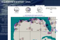
Example of marine observations for the Gulf of Mexico
One you select a region, click "marine observations." You can see wind and pressure data from some ships and buoys.
The site says the following on their main data page: "Please note that we have removed all ship callsign references on the various images and no longer produce text tables of marine observations. Additionally, all ship traffic from specific regions has also been removed. This change is in response to requests made by the Voluntary Observing Ship program. These changes were implemented to preserve the transmission of ship data between national weather centers as they are an invaluable source of marine data which we apply in our global and regional forecast and hindcast modeling."
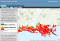
Example of Category 3 surge map along the Louisiana_coast
"This national depiction of storm surge flooding vulnerability helps people living in hurricane-prone coastal areas along the U.S. East and Gulf Coasts, Puerto Rico, U.S. Virgin Islands (USVI), Hawaii, and Hispaniola to evaluate their risk to the storm surge hazard. These maps make it clear that storm surge is not just a beachfront problem, with the risk of storm surge extending many miles inland from the immediate coastline in some areas."
"How this map was created: The SLOSH (Sea, Lake, and Overland Surges from Hurricanes) model is a numerical model used by NWS to compute storm surge. Storm surge is defined as the abnormal rise of water generated by a storm, over and above the predicted astronomical tides. Flooding from storm surge depends on many factors, such as the track, intensity, size, and forward speed of the hurricane and the characteristics of the coastline where it comes ashore or passes nearby. For planning purposes, the NHC uses a representative sample of hypothetical storms to estimate the near worst–case scenario of flooding for each hurricane category."
"Users of this hazard map should be aware that potential storm surge flooding is not depicted within certain levee areas, such as the Hurricane & Storm Damage Risk Reduction System in Louisiana. These areas are highly complex and water levels resulting from overtopping are difficult to predict. Users are urged to consult local officials for flood risk inside these leveed areas."
You should also view this page on the Potential Storm Surge Flooding Map, an operational product that will be based on a specific active storm. "NHC will release the initial map with the first issuance of a hurricane watch or warning or, in some special cases, a tropical storm watch or warning, for any portion of the Gulf or East Coast of the United States (anytime within 48 hours of the anticipated onset of tropical storm force winds). Once issued, the map will change every six hours in association with every new NHC full advisory package."
For additional information on the SLOSH model, visit the page here. For general information on storm surge, visit the NHC's Storm Surge Overview page. Please also make sure to view the disclaimer at the bottom of the National Storm Surge Hazard Maps's front page for important information about the SLOSH maps. The other pages have additional information about the limitations of the model, such as: "the SLOSH model does not explicitly model the impacts of waves on top of the surge nor does it account for normal river flow or rain flooding."
